Last week I delivered a ‘Coaching Conversations’ workshop for the Royal Society for the Blind. They are rolling out new CRM software and wanted tools for the ‘Power Users’ to assist their team members. We know that most learning happens on the job, so the workshop was designed to empower them with tips and tricks to help their team members with self-directed learning.
When rolling out new software, I always ask myself “How can we make this as simple as possible? How can we remove barriers and make it easy for people?” I was pondering this on the break when I was looking for the toilets, and I saw the large sign on the door.
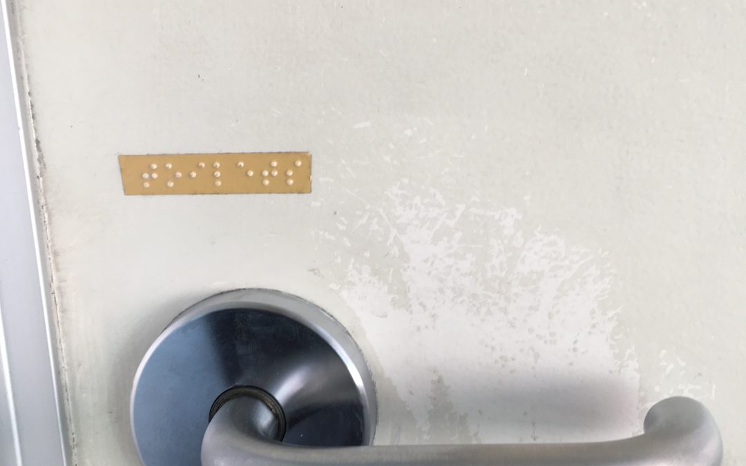
You can see the small sign to the left of the door – this was very difficult to read, especially in poor light and at a distance. Whereas the large TOILETS text on the door would be much easier for people with poor vision to read. And then when you look at the handle on the door you can see that there is braille text explaining what this room is. A great example of design that is fit for purpose.
As presenters we often think about what we should be saying and how we should be saying it. But that is only half of the equation. We need to ask ourselves how is my message being perceived? Is this the right delivery method? What changes do I need to make so that people can understand and absorb this information? In the end it’s all about the receiver.
Is the information you are presenting fit for purpose?
Worth thinking about…
- The Three Networking Circles You Need - April 15, 2024
- Mind Matters - February 1, 2024
- Are you a boss or a leader? - September 22, 2023


